It can be discouraging when an active manager’s short-term up capture isn’t on par with their long-term up capture. But this is a side effect of the measuring and using averages for risk/return metrics, returns, and the like. Averages naturally mask individual discrepancies and may produce misleading expectations. While averages are useful, it is important to remember their limitations.
Let’s take a look at how averages can mask individual variations by looking at the S&P 500. Between 1971 and 2017, the S&P 500 averaged an annual return of 10.68%. Across those 47 years, there was only one year that had a return near the average 10.68% return: In 2004, the S&P 500 had a return of 10.88%. In fact, there were only three years out of those 47 where the S&P 500 was within +/- 2% of its long-term average. In that span, the highest return was +37.58% (1995) and the lowest was -37.00% (2008). Individual year returns fell far and wide between those two bookends.
An average return is just that—an average. Inevitably some numbers will be higher, and some will be lower. Even though the S&P 500 averaged a return of 10.68% between 1971 and 2017, that period experienced individual years that were extremely high, like in 1995, or extremely low, like in 2008. Someone expecting a 10.68% return during 2008 would have been very upset. But over time, the numbers average out.
While many people understand the idea that returns in an individual period will differ from their long-term average, it is important to remember that the concept of averages extends to most risk and return metrics as well. Measurements like up/down capture will fluctuate in the immediate short term as a measure in any one given period is likely to be higher or lower than its long-term average.
While in the short-term up/down capture can give you an idea about a manager’s monthly or quarterly performance, the measure is much more useful over longer periods of time.
Extending the concept of averages, it would be a mistake to assume that a manager’s quarterly up/down capture will remain the same every quarter.
For example, let’s look at the up/down capture of the Defined Risk Strategy (DRS). Between July 1997 and December 2017, the quarterly up capture of the DRS has been 52.5% and the quarterly down capture has been 13.0%. During the same span for the S&P 500, there have been 58 up quarters and 24 down quarters. Sorted from worst-to-best, the 82 quarterly returns of the S&P 500 since July 1997 look like this:
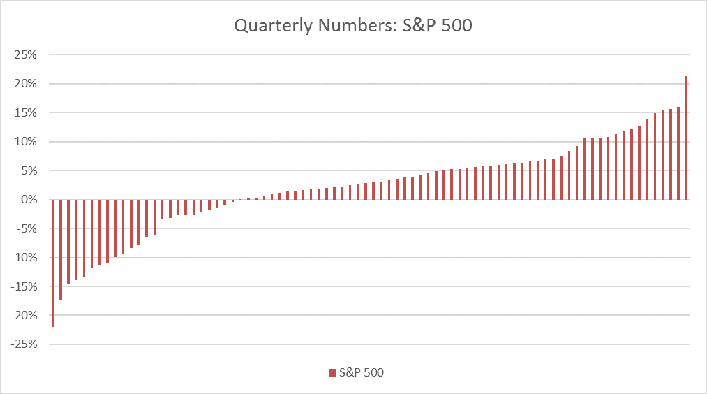
Source: Zephyr StyleADVISOR, Swan Global Investments
If the DRS never deviated from its average capture ratios and always participated in 52.5% of every up quarter and 13.0% of every down quarter, the returns of the DRS would look like this:
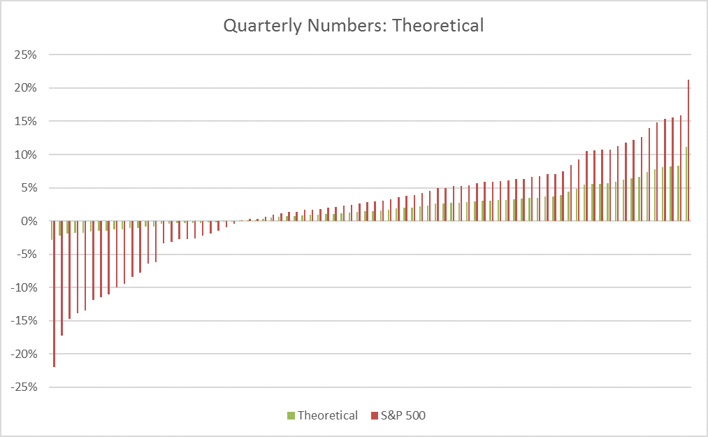
Source: Zephyr StyleADVISOR, Swan Global Investments
While the consistency and predictability of the measurement look cleaner, the reality of the situation is much less tidy.
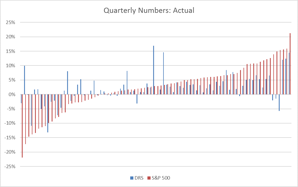
Source: Zephyr StyleADVISOR, Swan Global Investments
While the consistency and predictability of the measurement look cleaner, the reality of the situation is much less tidy.
Source: Zephyr StyleADVISOR, Swan Global Investments
As the graph shows, individual discrepancies can happen often. Sometimes the DRS captures much more than 52.5% of an up quarter, sometimes much less. Sometimes the DRS captures more than 13.0% of a down quarter, sometimes less. Despite the discrepancies, the long-term up/down capture averages to 52.5% on the upside and 13.0% on the downside.
One way to better understand the individual quarterly dispersions is to compare the individual quarters. The table below highlights the five biggest quarters of outperformance and underperformance versus the S&P 500:
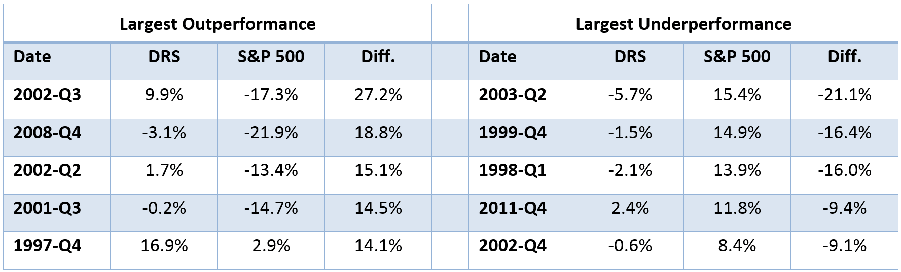
Source: Swan Global Investments
There are two primary takeaways from this table.
First, the periods of the greatest outperformance tend to happen during major, double-digit sell-offs and the largest underperformance tends to happen during large, double-digit rallies. Even though there are individual divergences, this pattern demonstrates that the DRS consistently performs the way it is intended.
Second, many of the periods of large dispersions happened early on in the DRS’s history. Eight of the ten biggest quarterly dispersions occurred within the first seven years of the DRS and none have occurred within the last five years. The DRS has evolved over the years with one of the goals being to reduce periods of huge dispersions, which it has been able to do.
The down captures are worth exploring in more detail because the context in which these capture ratios occurred sheds light on the results.
In the graphs below we see the rolling, five-year quarterly capture ratios, with up capture on the top and down capture on the bottom. You can see that on a rolling five-year basis the up captures range from 19.35% to 78.57% and the down captures range from -57.36% to 72.19%. It is important to remember that the lower the down capture, the better; a negative down capture indicates that the performance of the DRS was positive when the market was losing money.
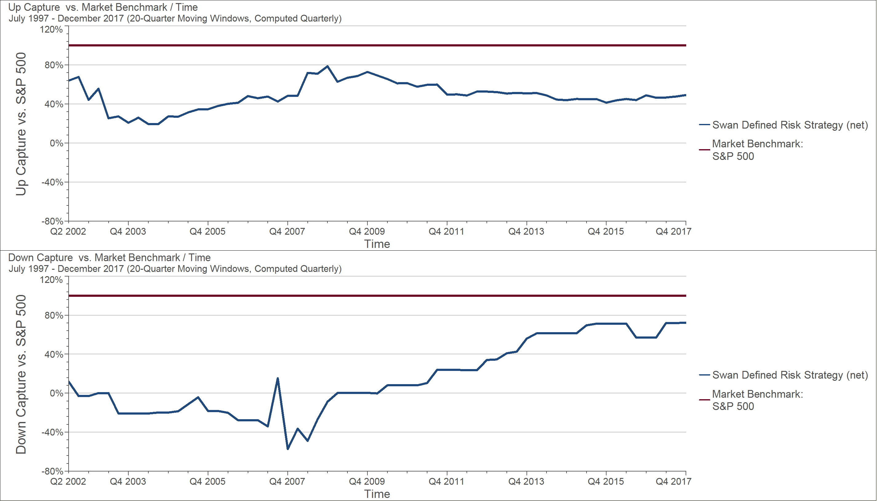
Source: Zephyr StyleADVISOR, Swan Global Investments
The point when down capture was at its best was the five- year period ending December 2007. This span included the tail end of the dot-com crisis and the start of the Global Financial Crisis. The point of the worst down capture is the current five-year period, ending December 31st, 2017. At this point, the bull market is almost nine years old. Within the last five years, only one quarter out of 20, the third quarter of 2015, was negative. The down capture of 72.19% represents only one data point.
In a way, this is a manifestation of the behavior of the DRS described in a previous blog post, “How Some Managers Walk the Line.” The DRS does not have a linear relationship with the market. The whole point of the DRS is to not track the market. This will inevitably lead to return patterns that are less driven by the S&P 500.
It is the goal of the DRS to produce a much more stable, predictable range of returns. This was discussed in depth in the blog post “The Importance and Value of a Non-Normal Distribution of Returns.” The trade-off for protection on the downside is giving up some of the upside. With a historic capture ratio of 52.5% on the upside and 13.0% on the downside, the DRS has achieved that. However, it is important to remember those ratios can and will fluctuate over shorter periods of time.
Marc Odo, CFA®, CAIA®, CIPM®, CFP®, Director of Investment Solutions, is responsible for helping clients and prospects gain a detailed understanding of Swan’s Defined Risk Strategy, including how it fits into an overall investment strategy. Formerly, Marc was the Director of Research for 11 years at Zephyr Associates.
Swan Global Investments, LLC is a SEC registered Investment Advisor that specializes in managing money using the proprietary Defined Risk Strategy (“DRS”). SEC registration does not denote any special training or qualification conferred by the SEC. Swan offers and manages the DRS for investors including individuals, institutions and other investment advisor firms. Any historical numbers, awards and recognitions presented are based on the performance of a (GIPS®) composite, Swan’s DRS Select Composite, which includes non-qualified discretionary accounts invested in since inception, July 1997, and are net of fees and expenses. Swan claims compliance with the Global Investment Performance Standards (GIPS®).
All Swan products utilize the Defined Risk Strategy (“DRS”), but may vary by asset class, regulatory offering type, etc. Accordingly, all Swan DRS product offerings will have different performance results due to offering differences and comparing results among the Swan products and composites may be of limited use. All data used herein; including the statistical information, verification and performance reports are available upon request. The S&P 500 Index is a market cap weighted index of 500 widely held stocks often used as a proxy for the overall U.S. equity market. Indexes are unmanaged and have no fees or expenses. An investment cannot be made directly in an index. Swan’s investments may consist of securities which vary significantly from those in the benchmark indexes listed above and performance calculation methods may not be entirely comparable. Accordingly, comparing results shown to those of such indexes may be of limited use. The adviser’s dependence on its DRS process and judgments about the attractiveness, value and potential appreciation of particular ETFs and options in which the adviser invests or writes may prove to be incorrect and may not produce the desired results. There is no guarantee any investment or the DRS will meet its objectives. All investments involve the risk of potential investment losses as well as the potential for investment gains. Prior performance is not a guarantee of future results and there can be no assurance, and investors should not assume, that future performance will be comparable to past performance. Further information is available upon request by contacting the company directly at 970–382-8901 or www.www.swanglobalinvestments.com. 030-SGI-011818