On the StatMAP, the omega ratio risk metric is a useful risk/return trade-off measurement for tail risk.
Put simply, Omega is the ratio of an investment’s gains relative to its losses. It gives you an idea of whether an investment’s return will be met or exceeded.
Keating and Shadwick developed the omega ratio and named their metric after the last letter in the Greek alphabet: omega. The idea was that omega would be the last metric anyone would ever need. While I don’t think there is an end-all, be-all risk metric, omega does offer unique insight into how outlier events impact an investment’s return distribution.
To think about this visually, let’s first look at the distribution of returns for the S&P 500 for 2016. In the graph below, we see a distribution of the 12 monthly returns sorted from worst to first. The worst return in 2016 was -4.96%, the best was 6.78%. Three months were negative, one was very close to zero, and eight months were positive.

Source: Zephyr StyleADVISOR
This graph might not be too interesting if one only looks at a single year. It’s chunky and doesn’t seem to tell you too much. However, if you were to expand the time horizon to something larger like 20 years, the picture becomes much more informative.

Source: Zephyr StyleADVISOR
The worst one-month return over the last 20 years was -16.79% and the best was 10.93%. Returns were positive (green area) 63.3% of the time whereas returns were negative (red area) 36.7% of the time. Roughly 74% of the returns fell somewhere between -5% and +5%. This graph gives us an excellent idea of what the overall distribution of returns looks like.
The omega ratio is derived from this graph. The green area, the gains, represents the count and scale of monthly returns that fall above a minimum accepted return (MAR), in this case set to 0%. Ideally, this green area would be quite large. The red area, on the other hand, represents the count and scale of observations that fall below the MAR, the losses. One would hope this area to be as small as possible. Omega is calculated by dividing the good, green area by the bad, red area[1].
What should be apparent by looking at the omega ratio graph is the impact of outlier events on the calculation of omega. If there are numerous observations well below (or above) the MAR, they will equate to large amounts of real estate. Conversely, if most of the monthly observations fall somewhere close to the MAR, they won’t generate a lot of area to be measured. Therefore, omega is an excellent metric for determining the impact of extreme, outlier events.
Since omega is a ratio with a “good” number in the numerator and a “bad” measure in the denominator, an analyst would hope to see large omega numbers. And just like the pain index or pain ratio, there is not an absolute value that one can use as a reference point to determine whether an omega is good or bad. The omega ratio would need to be compared against that of a benchmark or a group of peers.
If there is one drawback to omega, it is that it rolls the “good” (the green area) together with the “bad” (the red area) to form a single number. But what if one only wants to analyze the downside risk or upside potential in isolation? Omega doesn’t account for that. After all, it’s possible that Manager A has a very small green area and a very small red area and Manager X has very large green and red areas and at the end of the day, the omegas are roughly the same. This situation is displayed in the chart below.
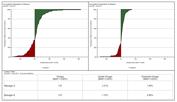
Source: Zephyr StyleADVISOR
One refinement to the concept of omega is to simply look at the two halves independently and not roll them up into a single ratio[1]. This is called upside omega and downside omega. Obviously, one hopes upside omega is large, signifying 1) many observations above the MAR, 2) extreme observations above the MAR, or 3) both. Conversely, one hopes downside omega is small for the same reasons.
The omega ratio can help advisors understand how well an investment strategy or alternative approach mitigates tail risk. Advisors will want to compare the omega ratios of a few funds to properly assess this.
Using the Defined Risk Strategy (DRS) as an example, the DRS Select Composite has historically done a good job mitigating losses. However, there is a cost to this: The price of protecting on the downside is to give up some of the returns on the upside. The graph below illustrates this trade-off.
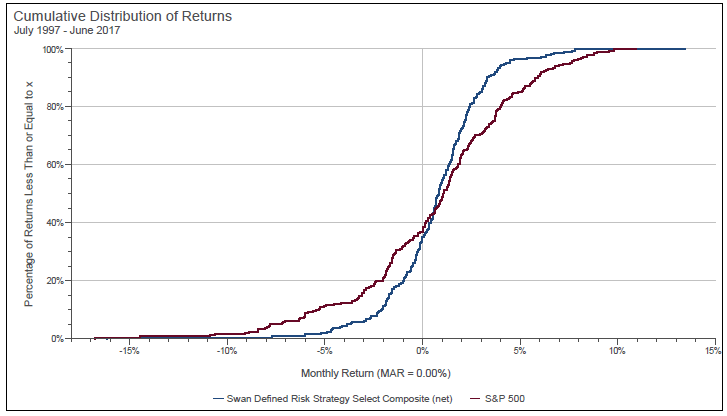
Source: Zephyr StyleADVISOR. The S&P 500 Index is an unmanaged index and cannot be invested into directly. Past performance is no guarantee of future results. DRS results are from the DRS Select Composite, net of all fees, from July 7, 1997 to June 30, 2017.
The S-graph for the DRS Select Composite is narrower than the S-graph for the S&P 500. The area encapsulated by the count and scale of returns less than 0% (i.e., the downside omega) is smaller than that of the S&P 500—a good thing. However, the trade-off is the upside omega area, representing the count and scale of returns greater than 0%, which is less than that of the S&P 500.
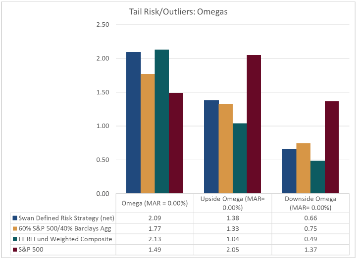
It has always been Swan’s philosophy that protecting against losses is more important than capturing all of the upside gains. The graphs below illustrate how the DRS Select Composite’s history reflects this bias between the months of July 7, 1997 and June 30, 2017.
Source: Zephyr StyleADVISOR, Swan Global Investments. The Barclays U.S. Aggregate Bond Index and the S&P 500 Index are unmanaged indices and cannot be invested into directly. DRS results are from the DRS Select Composite, net of all fees, from July 7, 1997 to June 30, 2017. Past performance is no guarantee of future results. Structures mentioned may not be available within your Broker/Dealer.
You can quantify this trade-off by dividing the upside omega by the downside omega to get the overall omega ratio. For the DRS, the omega is 2.09, whereas the omega for the S&P 500 is 1.49. As stated earlier, one would hope to have larger omega numbers; this means the ratio between the good and bad areas of the distribution is skewed more to the positive with the DRS.
The omega ratio for the DRS is slightly less than that of the hedge fund index, 2.09 versus 2.13. The DRS has more upside omega (1.38 vs 1.04) but also more downside area (0.66 vs 0.49). At the end of the day, the trade-off between upside and downside is roughly equal between the two.
While omega won’t be the one and only risk metric to evaluate investments with, omega provides insight into how outlier events affect the distribution of a given investment—an important attribute for those who want to protect investment portfolios from major market events. Advisors can use this metric when comparing funds’ historical experiences in avoiding or minimizing the impact of “black swan” events.
Marc Odo, CFA®, CAIA®, CIPM®, CFP®, Client Portfolio Manager, is responsible for helping clients and prospects gain a detailed understanding of Swan’s Defined Risk Strategy, including how it fits into an overall investment strategy. Formerly, Marc was the Director of Research for 11 years at Zephyr Associates.
[1] The K-ratio was first proposed by Lars Kestner in 1996. The Zephyr K-ratio is a variation of the K-ratio that removes an element of the formula that incorporates the number of data points used in the calculation. http://www.styleadvisor.com/sites/default/files/article/zephyr_concepts_zephyr_k_ratio_pdf_41672.pdf
[2] Because this is a cumulative return graph, it takes into account the compounding of wealth. In order to superimpose a best-fit line over a compounding series, the graph must first be converted to a log scale.
Swan Global Investments, LLC is a SEC registered Investment Advisor that specializes in managing money using the proprietary Defined Risk Strategy (“DRS”). SEC registration does not denote any special training or qualification conferred by the SEC. Swan offers and manages the DRS for investors including individuals, institutions and other investment advisor firms. Any historical numbers, awards and recognitions presented are based on the performance of a (GIPS®) composite, Swan’s DRS Select Composite, which includes non-qualified discretionary accounts invested in since inception, July 1997, and are net of fees and expenses. Swan claims compliance with the Global Investment Performance Standards (GIPS®). The Swan Defined Risk Strategy Select Composite demonstrates the performance of non-qualified assets managed by Swan Global Investments, LLC since inception. It includes discretionary individual accounts whose account holders seek the upside potential of owning stock, and the desire to eliminate most of the risk associated with owning stock. The Composite relies on LEAPS and other options to manage this risk. Individual accounts own S&P 500 exchange traded funds and LEAPS associated with the exchange traded funds as well as multiple other option spreads that represent other indices that are widely traded. The Defined Risk Strategy was designed to protect investors from substantial market declines, provide income in flat or choppy markets, and to benefit from market appreciation. Stock and options are the primary components of the strategy.
All Swan products utilize the Defined Risk Strategy (“DRS”), but may vary by asset class, regulatory offering type, etc. Accordingly, all Swan DRS product offerings will have different performance results due to offering differences and comparing results among the Swan products and composites may be of limited use. All data used herein, including the statistical information, verification and performance reports are available upon request. The S&P 500 Index is a market cap weighted index of 500 widely held stocks often used as a proxy for the overall U.S. equity market. The 60/40 benchmark is a blended composite, weighted 60% in the aforementioned S&P 500 Index and 40% in the Barclays US Aggregate Bond Index to represent balanced portfolios. The Barclays US Aggregate Bond Index is a broad-based flagship benchmark that measures the investment grade, US dollar-denominated, fixed-rate taxable bond market. The index includes Treasuries, government-related and corporate securities, MBS (agency fixed-rate and hybrid ARM pass-throughs), ABS and CMBS (agency and non-agency). HFRI Fund Weighted Composite Index: The HFRI Fund Weighted Composite Index is a global, equal-weighted index of over 2,000 single-manager funds that report to HFR Database. Constituent funds report monthly net of all fees performance in US Dollar and have a minimum of $50 Million under management or a twelve (12) month track record of active performance. The HFRI Fund Weighted Composite Index does not include Funds of Hedge Funds.
Indexes are unmanaged and have no fees or expenses. An investment cannot be made directly in an index. Swan’s investments may consist of securities which vary significantly from those in the benchmark indexes listed above and performance calculation methods may not be entirely comparable. Accordingly, comparing results shown to those of such indexes may be of limited use. The adviser’s dependence on its DRS process and judgments about the attractiveness, value and potential appreciation of particular ETFs and options in which the adviser invests or writes may prove to be incorrect and may not produce the desired results. There is no guarantee any investment or the DRS will meet its objectives. All investments involve the risk of potential investment losses as well as the potential for investment gains. Prior performance is not a guarantee of future results and there can be no assurance, and investors should not assume, that future performance will be comparable to past performance. All investment strategies have the potential for profit or loss. Further information is available upon request by contacting the company directly at 970–382-8901 or www.www.swanglobalinvestments.com. 191-SGI-051018